Data analysis skills are one of the hottest skills that have been in high demand on the job market for the past few years. A "data analyst" job title is not new to the market, however, due to the growth of data generation and the facilitation of data storage provided by cloud computing, many companies have now the capabilities to store their big data and to derive insights and value from it. Data analysis has been and will stay a fundamental skill to have for most jobs. In the following, I will discuss how to start a career as a data analyst and how I was able to secure a job as a data analyst at a reputable company. Disclaimer Prepare yourself for the worse; learn more about that here . You should read it if You are looking for an internship or a junior opportunity as a Data Analyst. Data Analyst Trends A simple search of the term " Data Analyst " on google trends can show us a graph with a positive trend of the frequency of searches. We can observe that from 2...
Many persons want
to become data analysts
and scientists. However, not too many people working in that field are telling
exactly what to expect. Most videos on YouTube are very vague and made using
datasets from Kaggle, which are in many cases clean (general structure), but
require filling missing values.
At work, the data is ugly. In the following we will discuss why...
Who should Read it...
Anyone looking to start their career as a Data Analyst and co.
How to Read it
Fully. Or watch the video on Youtube.
Dataset
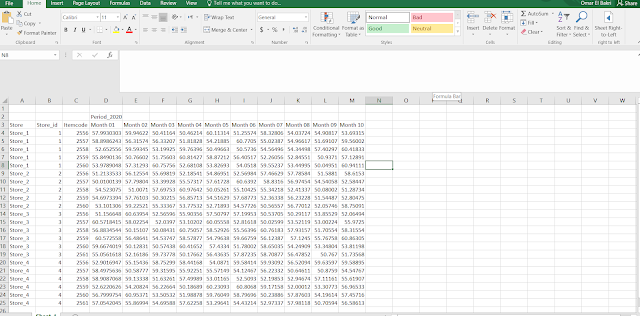
The dataset used in the following, can be considered as something to be
expected from a client. It is a real life template, with all the values
changed for privacy purposes.
Now the issues with this data is that it is considered wide. So it isn't
possible to visualize it on Python unless some transformations are applied to
it. The ultimate goal is:
- To extract the year from "Period_2020", then extract the 01 from "Month 01" so we can create a reference date.
- List the transactions vertically (long format).
Using Python...
- Importing the needed packages.
- Reading the excel sheet with the correct header.
- Renaming the columns while conditioning on 'Unnamed' columns
- Dividing the dataset into 2 parts, one part can be considered as an index and will not be modified, the second part (values for the revenues) to be transformed into long (stacking).
- Merging the two parts again.
- Creating reference date.
- Cleaning the final output.
import pandas as pd
from dateutil.relativedelta import *
import datetime
import matplotlib.pyplot as plt # for visualization
file_name = "../Datasets/ToyDataset.xlsx"
data = pd.read_excel(file_name, header=[1,2])
data.columns = [x[1] if "Unnamed" in x[0] else '{}_{}'.format(x[0], x[1]) for x in data.columns]
part1 = data.loc[:,:"Itemcode"].copy()
part2 = data.loc[:,"Period_2020_Month 01":].stack().reset_index().copy()
part2.columns = ["index","date","value"]
full_data = pd.merge(part1,part2,how="inner",left_index=True,right_on="index")
full_data["Year"] = 2020
full_data["Month"] = full_data["date"].str[-2:].astype(int)
full_data['reference_date'] = [relativedelta(day = 31) + datetime.datetime(year,month,1)
                               for year,month in zip(full_data["Year"],full_data["Month"])]
full_data["reference_date"] = pd.to_datetime(full_data["reference_date"])
full_data.drop(columns=["index","Year","Month","date"],inplace=True)
Input versus the output...
Now that we have done the main work, we can see how the two datasets differ,
in the following:
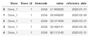
The output (first 5 rows showing)
The input (first 5 rows showing)
As you can see, transforming from wide to long will cause a duplication of
the first three columns, however, the 'reference date' will be the new
unique identifier.
In addition, with this new format, it becomes easier for us to choose one
'itemcode' and to create a graph that shows the revenues overtime made by
the product in all the stores.
Visualizing the results...
subset = full_data[full_data["Itemcode"] == 2556]
one_item = subset.groupby("reference_date")["value"].sum().reset_index()
plt.plot(one_item["reference_date"],one_item["value"],"-o")
plt.xticks(rotation=30)
plt.show()
Discussion
At school and universities or even sites like Kaggle, UCI... Datasets are
usually cleaned and come in good formats. The data scientist/analyst wouldn't
have to invest much time in cleaning the data or trying to read it correctly.
However, in real life, sometimes you will receive 4 excel sheets per month for
weekly sales. And they all have the same template. Therefore, the best way to
process them is by creating a function/script that you run every time you
receive a new dataset to transform it into the correct shape. The problem is
that not every client will send the same template. Which means for every
client you have, you will need a function for his template...
The major problem is that the people filling the datasets, don't really know
anything about coding. All they care about (in many cases) is to have a
'pretty' excel file. Unfortunately, in many cases, the prettier the excel
sheet, the worse it gets to deal with it as data analysts.


Comments
Post a Comment